
Showing posts with label Technical Analysis. Show all posts
Showing posts with label Technical Analysis. Show all posts
Stochastic Oscillator
A stochastic oscillator
The Stochastic Oscillator (Stochastic) is obtained by
calculating the exponential averages from the % K index, which is a current rate of the cryptocurrency.
To analyze this oscillator, it is necessary to determine the
levels of overbought and out-sell. The overbought level is usually set at 90%
and the selling level at 10%.
a stochastic oscillator.

A buy signal is generated when
the ratio increases above the sell-out level and the averages cross.
The sales signal is generated when the indicator drops
below the overbought level. As you can see only buy signal is reliable when it comes to Bitcoin.
Rate of Change ROC
ROC change rate
ROC (Rate of Change) is next to MACD the most used indicator
of technical analysis.
To analyze this indicator, it is necessary to determine the
overbought and oversold levels. These levels should be set so that in the area
between them there was approx. 90% of the indicator's progress. The upper limit
of this area is determined by the overbought level (mine is set at 60), while the lower limit is
the sell-out level (mine is set at -20).

The buy signal is generated with the indicator rising
above the sell-out level -20.
The sales signal is generated when the indicator drops
below the overbought level 60.
Commodity Channel Index CCI
CCI (Commodity Channel Index)
The CCI oscillator is most often
used to determine buy signals. CCI is most often analyzed based on the signal lines line (moving averages).
It is also possible to analyze the ratio based on the overbought
/ oversold levels (see ROC). The characteristic feature of CCI is that it
usually generates buy signals earlier than other indicators.
The buy signal is generated when the 9MA of CCI Index crosses 14MA of CCI (at a very low level).

Volume
Trading volume
Investors assessing the situation on
futures or crypto markets usually use the three-volume method - price, volume and number
of open orders. It is estimated that the price is the most important. The
volume and number of open interests are usually treated as confirmation
indicators, with the volume being more important.
The number of open interests or orders ranks third. Analytical research proves that apart from the observation of
price movements, tracking of volume and the number of open interests sometimes brings important indications as to the direction of the market. With
this in mind, a diligent investor should follow all these values. The volume is
the number of exchanges or contracts concluded in the defined period. The number of open interests is the number of non-liquidated contracts or book orders by the end of the period.
Tips for interpreting the volume and number of open orders.
Investors should observe changes in the volume
and number of open book orders when assessing the market condition. The general
rules for interpretation are presented below:

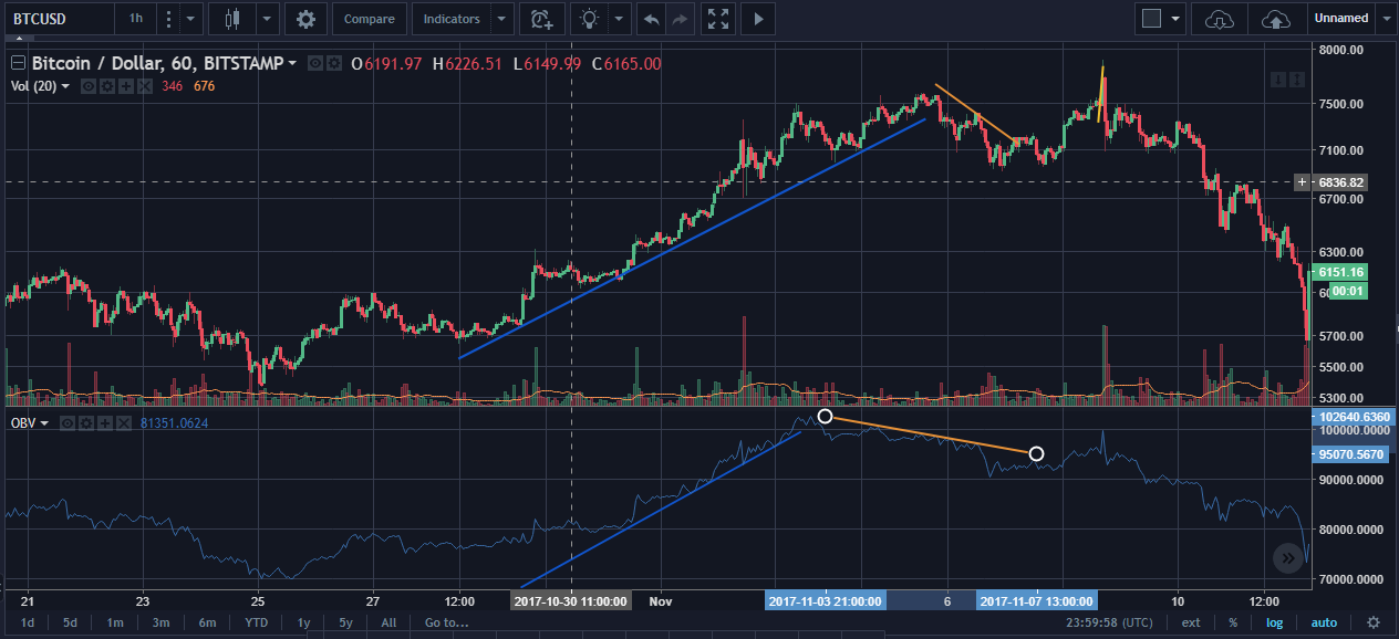
OBV (On Balance Volume) line
The OBV line works well to analyze the
capital flow accompanying the price movements. The construction of
the OBV line is quite simple. Depending on changes in the price (increase
or decrease), the volume is assigned a positive or negative value,
respectively. The increase in the crypto price translates into recognition
of the volume with the positive sign, while the price decreases the
negative volume.
We receive current cumulative balances by adding or
subtracting the volume from each day, depending on the direction of the
price. The rate does not matter in the case of OBV
lines, while the direction of the OBV lines is important. When analyzing the
OBV curve investors should use the trend line too.
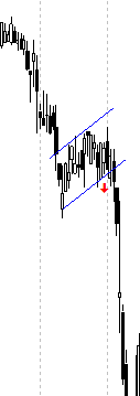
Flags and Pennants
Flag and Pennant
Flag
The flag is one of the most
"secure" formations. It is most often formed in the timeline from 3 to
4 weeks for stocks and 1 to 2 days for crypto and occurs after a very fast (almost vertical) price movement. The flag
announces the continuation of traffic in a given direction.

During the formation of the flag, the volume of turnover
should decrease very clearly. The range of movement after breaking from the
formation should be at least equal to the size of the movement to reach it,
measured from some characteristic point - eg from breaking from the previous
formation or breakthrough of resistance level (measurement of movement is
marked with a vertical purple line). Perfectly in line with the pattern, the
flag announces the continuation of the specified range with a probability of up
to 90%.
When assessing the correctness of the flag, remember that:
- formation should occur after almost vertical movement of prices (without major corrections)
- the volume should decrease very clearly during formation formation
- if the formation takes long to establish, then it could be very suspicious. Therefore don't wait to long.
- when broken up, the volume should clearly increase.
Strategy
Price increase Flag (Figure 1)
If you have shares:
- sell if there was a distinct increase in volume during the movement that did not lead to the breakout
- sell if the break has not occurred within 3 weeks or 3 days for crypto of the beginning of the formation and the volume does not behave perfectly according to the theory
- if it breaks down, sell it immediately
If you do not have shares:
- buy after the formation of the pattern with a good volume system, do not waiting for the upward break its better to set a stop loss if broken down
Flag with access from the top (Figure 2)
If you have shares:
- sell after the formation formation (even before the break)
If you do not have shares:
- do not buy (even after breaking up)
Market example
Pennants
The Pennant is next to the flag one of the most
"certain" formations. It is most often formed in the period from 3 to
4 weeks and occurs after a very fast (almost vertical) price movement.
Pennant announces the continuation of movement in a given direction.
flag formation

During the formation of the pennant, the volume of turnover
should decrease very clearly. The range of movement after breaking from the
formation should be at least equal to the size of the movement to reach it,
measured from some characteristic point - eg from breaking from the previous
formation or breakthrough of resistance level (measurement of movement is
marked with a vertical purple line). Ideally aligned with the pattern, the flag
announces the continuation of the specified range with a probability of up to
90%.
When assessing the correctness of the pennant, keep in mind
that:
- formation should occur after almost vertical movement of prices (without major corrections)
- the volume should decrease very clearly during formation formation
- the end of the formation should take place in less than 3 weeks for stocks and 3 days for crypto from the beginning of the formation - pattern longer than 3 weeks are already suspicious (the beginning of the formation was marked with the letter B in the drawing, the end with the letter E)
- when broken up, the volume should clearly increase.
Strategy
Flag with access from the bottom (Figure 1)
If you have shares:
- sell if there was a distinct increase in volume during the movement that did not lead to the breakout
- if it breaks down, sell it immediately
If you do not have shares:
- buy after the formation formation with a good rotation volume system, not waiting for the upward break (if you sold earlier - when you reach the formation, buy even at higher prices)
Flag with access from the top (Figure 2)
If you have shares:
- sell after the formation (even before the break).
If you do not have shares:
- do not buy (even after breaking up)
Market example

Wedges
Wedges
An upward wedge
An upward wedge is a
formation that "always" promises a price drop. It often develops
during short rises with long-term falls or in the last phase of the boom.
Determination of the wedge is possible only after noticing four points (1,2,3,4)
turning, which determine the upper and lower edge of the
wedge. The exit from the wedge (X) should occur not earlier than 30%
before its end (the beginning and the end define: the first point - the turning
point and the vertex. Very often, after breaking, there is a short return
movement up (marked in yellow) and only then there is a further discount. The
size of the drop is indirectly dependent on the height of the wedge.

Strategy:
If you have shares:
- sell after breaking down
Drop wedge
The discounted wedge
is a formation that "always" promises a price increase. It is more
often shaped during the medium-term adjustment of the upward trend than during
long-term decreases. Determination of the wedge is possible only after noticing
four turning points (1,2,3,4), which determine two decreasing straight lines -
the upper and the lower edge of the wedge. Breaking from the wedge (W) should
take place no earlier than 30% before its end (the beginning and the end
determine: the first point - the turning point and the vertex) and should
be confirmed by the significant increase in the volume of turnover. Very often,
after breaking, there is a correction and only after this
correction there is a proper increase. Its length is indirectly dependent on
the height of the wedge, however, the increase usually ends near the nearest
clear resistance.

Strategy
If you have shares:
- sell on 3 and buy back the shares on 4
If you do not have
shares:
- buy only after breaking up (confirmed by an increase in the volume of turnover and at the right time)
Rectangular Formation
Formation of a rectangle
Rectangles are more likely to predict the continuation of
the earlier trend than its reversal. The formation of the rectangle is
determined by horizontal lines routed by two bottoms and tops. Only after
establishing these four points can one speak of the formation of a
rectangle. Within the formation, the volume of turnover should show a downward
trend. Quite often, there are exactly six turning points before the strike
within the rectangle.

The buy signal is generated after breaking through the upper
edge, the volume must clearly increase (Figure 1). Often, after breaking, there
is a correction movement - marked in green.
The sales signal is generated after the bottom edge has been
pierced (Fig. 2). The size of the rise or fall in prices after breaking from
the rectangle should be at least equal to the height of the formation (see the
purple line in the figure).
Strategy
If you have shares:
- as soon as the formation is established (two peaks and two bottoms, i.e. after the fourth turning point), you can buy near the bottom and sell near the top
- if it breaks down from the formation, sell it immediately
- after breaking up, sell at a break and buy back on a correction
- If you do not have shares:
- in the case of a rectangle after the rise (figure 1), buy at the sixth turning point (6)
- buy only on a correction after breaking up (confirmed by the increase in the volume)
Triangles
Triangles (symmetrical, upward, downward)
Symmetrical triangle
The symmetrical triangle more often
announces the continuation of the earlier movement than its reversal. Formation
is determined by two convergent lines led by two peaks and two bottoms. It is
only after determining these four points (1,2,3,4) that the formation of the pattern can be discussed.
Within the formation, the volume should
show a downward trend. Quite often within the triangle there are exactly six
turning points before breaking. The buy signal is generated after breaking
through the upper edge, while the volume must clearly grow.
Not
infrequently, after breaking, there is a corrective movement.
The sales signal is generated after piercing the bottom edge of the formation. The break from the symmetrical triangle should occur within 50% to
25% before its end (vertex, peak angle) from the beginning of the formation. Very often the level determined by the vertex of the triangle is a
strong support or resistance.

Strategy
If you have shares:
- when breaking up, sell on the break and buy back the shares on the correction (if the break has been confirmed by the increase in the volume of turnover)
- if it breaks down from the formation, sell it immediately
If you do not have shares:
- buy only on a correction after breaking up (confirmed by the increase in the volume of turnover)
Note: It is very important that the
knocking occurs within a certain time (50-25% before the end of the triangle)
An upward triangle
The upward triangle is a formation in which the upper edge is a horizontal line and the lower line is an upward line. Formation can be determined only after the establishment of two peaks at the same level and two bottoms. During the development of the triangle, the volume of turnover should decrease. The buy signal is generated after breaking through the upper (horizontal) edge with a marked increase in the volume of rotation. Not infrequently, after breaking, there is a corrective movement. The breakout triangle should occur not later than 25% before its end, counting from the beginning of the formation (B), ie the first turning point to the intersection of the triangle arms (E) . The size of the price increase after breaking the triangle should be at least equal to the height of the formation measured at the second turning point (see the purple line in the figure). Very often, the level determined by the top edge is strong support after breaking out X

Strategy:
If you have shares:
- when breaking up, sell on the break and buy back the shares on the correction (if the break has been confirmed by the increase in the volume of turnover)
- if you break down from the formation, beware of other sales signals and if they occur, sell immediately
If you do not have shares:
- buy only on a correction after breaking up (confirmed by the increase in the volume of turnover)
Note: It is very important that the
knocking occurs within a certain time (not later than 25% before the end of the
triangle, preferably around 2/3 of the formation's length)
A downward triangle
A downward triangle is a formation in
which the bottom edge is a horizontal line and the upper line is a downward
line. Formation can be determined only after establishing two lows at the same
level and two tops. During the development of the triangle, the
volume of turnover should decrease. The sales signal is generated after
piercing the bottom (horizontal) edge. Sometimes, after breaking, there is a
corrective movement (marked in green). The break from the downhill triangle should
occur not later than 25% before its end counting from the beginning of the
formation (B), ie the first turning point to the intersection of the triangle
arms (E). The size of the drop after
breaking the triangle should be at least equal to the height of the formation
measured at the second turning point (see the purple line in the figure). Very
often, the level determined by the bottom edge is a strong resistance (X).

Strategy
If you have shares:
- if it breaks down from the formation, sell it immediately
Diamond Patterns
Diamond Patterns
A diamond can be both a formation of the trend reversal as
well as its continuation. This system has the shape of two interconnected
triangles: the expansion and the isosceles.
The volume increases with the increase of price ranges (the highest
should be at the highest or lowest point of the diamond), to decrease as the ranges
decrease to the increase when breaking the formation. The direction of breaking
out of the formation tells us whether we are dealing with a reversal
(dislocation in the opposite direction to the movement) or continuation
(dislocation towards the previous movement).

Diamonds appear rather rarely and look like two connected
triangles: inverted and symmetrical. The formation of a formation can take
place after the formation of both triangles.
V Shape Pattern
V Shape Formation
Formation V belongs to the formation of the reversal of the
trend. This formation begins with a sharp and strong decline, followed by an
equally violent turn and strong reflection, usually due to the appearance of
some unexpected news, which causes the formation to take the shape of the
letter V.


The difficulty in the formation of V shape is that this pattern arises without a transitional period and it is hard to capture it before its
creation. Often the only herald to confirm the occurrence of it is a turning point
by a very large volume.
The indication of the extent of the increase /
decrease on the basis of this formation is also somewhat difficult to determine. It can be
said that V patterns are usually recognized after the fact, but then it is
too late to open positions based on them.
Cup and Handle Pattern
Cup and Handle Formation
Cup and Handle is one of the most profitable formations because the
price increase after breaking out is often very large. When creating a
formation, the shape of the course resembles a cup. Volume
behaves similarly to the rate (it also has the shape of a cup) but its
fluctuations are slightly ahead of the price movements (volume starts
to rise or fall slightly earlier than the price). If the price rises during the
shaping of the saucer, the volume must also grow strongly.
The
buy signal occurs after breaking above the level designating the upper boundary
of the formation - this level is determined by the left part of the cup developed at the highest volume at that time. The break from the cup must be confirmed
by a strong increase in the volume. Often, after breaking, there is
a correction movement down (marked yellow), after which the increase is
continued. In the charts of cryptocurrency with small capitalization and low share
prices, it is sometimes possible to create few cups in a row (one after the other,
each at a slightly higher level).

or multiple:

Double Top and Double Bottom Patterns
Double Top
This formation (also known as "M") occurs in the final stage of the long- or medium-term Price Increases and promises to reverse the trend. Formation is determined by two price peaks at the same level (green line) separated by a distinct decreases in prices. The turnover volume is often the largest when setting the first peak. The sale signal is generated after breaking below the bottom price (red line) generated between two peaks and must be accompanied by a marked increase in the volume. Sometimes, after breaking, we deal with a Bull trap (yellow line).

Double Bottom
This formation (also known as "W") occurs in the
final stage of the long- or medium-term price decrease and promises to reverse the
trend. Formation is determined by two price bottoms (red line) at the same level separated by a distinct increase in prices. The turnover volume is often the
largest when setting the first bottom. The buy signal is generated after breaking above
the price top (green line) generated between two bottoms and must be accompanied by a marked increase in the
volume. Sometimes, after breaking, we deal with a Bear trap (yellow line).

Inverted Head and Shoulders
Head and Shoulders Inverted Formation
The reverse head and shoulder formation also belongs to the
classic price structures that reverse the trend. This structure announces the
end of the downward trend.

Full formation education occurs after determining four
characteristic points (1,2,3 and 4). Points (1) and (3) indicate the formation
arms, point (2) means head. The last, fourth point is determined after breaking
the line of the neck (marked with a thin blue line).
In the classic form of this formation, the turnover should
be shaped in accordance with the price formation and the direction of the new
nascent upward trend.
- The left arm is shaped on a relatively small volume.
- The head should be shaped on an even smaller volume.
- The first increase in the increased volume turnover and the subsequent decrease in the smaller volume turnover are the characteristic features of shaping the right arm in the classic form of this formation.
- An increase in the price above the neck line should take place with increased demand side activity expressed in turnover, which absorbs large supply at higher and higher price levels.
Overcoming the neck line on a high volume is a
confirmation of formation and a buy signal for a given market. Any subsequent
return of price to the neck line (return movement) should take place on a
smaller turnover, which would confirm its corrective character in relation to
the emerging new upward trend.
The size of the price movement after breaking the formation
(above the breaking point- red dot) should be at least equal to the head height
measured from the neck line (purple line).
Note 1: The neck line does not have to be horizontal.
Note 2: Formation "mutations" are possible, e.g. two
heads.
Head and Shoulders Formations
Head and Shoulders formation
Formation of the head and shoulders belongs to the classics
of technical analysis and is one of the basic price structures reversing the
upward trend. This price structure consists of three peaks shaped at the top of
the upward trend. The left peak (left shoulder) and the right top (right
shoulder) are shaped at a slightly lower level than the central maximum (head).

Full formation education occurs after determining four
characteristic points (1,2,3 and 4). Points (1) and (3) indicate the formation
arms, point (2) means head. The last, fourth point is determined after piercing
the neck line (marked with a thin blue line).
The maintenance of the volume of turnover is a very
important element in shaping this price structure.
- The amount of rotation during shaping the head should be less than during shaping the left arm. This behavior of turnover is the first sign of weakening of the upward trend.
- The right arm should be shaped on an even smaller volume of rotation.
- The price drop below the neck line should take place on the increased turnover volume, which proves the aggressive approach of the supply side, which quickly satisfies the reported demand at ever lower price levels.
The possible return of the price to the height of the neck
line should take place with definitely lower turnover.
The confirmation of the formation is a
subsequent price decline confirmed by a large volume of trade. The minimum extent of
the decline is calculated by measuring the height of the formation from the neck
line down.
The size of the price movement after breaking the formation
(measured from the breaking point - red dot) should be at least equal to the height
of the head above the neck line (purple line).
Note 1: The neck line does not have to be horizontal.
Note 2: It is possible to "mutations" form the
head and shoulders, e.g. two heads.
If you have shares:
sell if the price drops at least 5% below the neckline
Fibonacci Level Lines
The Fibonacci Levels
The Fibonacci number string is used by many investors around
the world. Fibonacci numbers in investments are most often used in two ways:
- As the elimination of vertical price levels and
- As target levels, prices in time (level).
Leonardo Fibonacci was one of the most famous Italian
mathematicians. The effect of his mathematical inquisitiveness was to create a
series of numbers that have interesting properties and which often occur
spontaneously in nature as an ideal representation of proportions. The string
that we are interested in is briefly described in this way: 1, 1, 2, 3, 5, 8,
13, 21, 34, 55, 89, 144 etc. The number that we are interested in arises by
summing up two previous ones, for example: 1 + 2 = 3; 2 + 3 = 5; 5 + 8 = 13
etc.
Another interesting property of the string is the fact that
if we divide the number by the number of the next in the string, we always get
a result close to 0.618, for example: 5/8 = 0.625; 34/55 = 0.618; 89/144 =
0.618 and if we divide the number by its predecessor, we get an oscillating
result around 1.618, e.g. 55/34 = 1.617, 144/89 = 1.6179, 233/144 = 1.618 -
both of these properties are known in geometry as golden breakdown. If we would
like to divide the number by the second in number, we always get a value close
to 0.382, for example: 34/89 = 0.382, 55/144 = 0.381, etc. The string has many
interesting properties, however, the above are the most important for us.
In technical analysis, the most common values are: 0.236;
0.382; 0,500; 0.618; 1; 1.382 and 1.618.
Traders use the Fibonacci lifts to:
- marking support / resistance,
- destinations (ie places of profits and stop loss orders).
The market often "descends" slightly below 38.2 or
61.8% of the level of the preceding wave, followed by a clear reflection
and continuation of the previous movement. These types of traps happen at every
step.
Thus, it turns out that if the market violates the 61.8%
lifting, it very often stops at 0.685 of the previous wave and then returns to
its original direction.

There are also frequent situations in which the market
stands above the important peaks and then negates the breakdown, price going below
its level and creating a formation similar to a double peak (similar scenarios
also occur in the case of unsuccessful attempts to break the market below
significant bottoms).

Looking at such characteristic and repeated market
behaviors, you can calculate the level of support or resistance using Fibonacci
numbers.
This situation is also in case of attempting to
pierce an important peak. In this scenario, the market often stops at
the external level of the preceding wave, which is usually 138.2% or
161.8%.

Following is the video of how to use Fibonacci lines tool in Trading View.
Charts
Charts
Charts are the investor's best friend on
the stock or crypto market. As an investor, you'll probably use charts more often than
other available tools. As the charts will probably play a significant role in
your investments, it is necessary to familiarize yourself with them. The more
comfortable you feel using the charts, the better you will be an investor.
To help you get acquainted with and
effectively use charts, we will further develop the following concepts:
- Rules for creating charts
- Time periods of charts
- Types of charts
Chart options
Let's start with the basics and look at
how the price charts are created. When you understand the basics, you
will be more successful in applying the more advanced concepts of technical
analysis.
- The graph consists of two axes: the X axis (horizontal) and the Y axis (vertical).
- The X axis runs horizontally along the chart, indicating the time of price changes that have occurred on the selected instrument.
- The Y axis runs vertically along the left part of the graph, showing the price movement on the chart. Lower prices are at the bottom of the axis, higher at the top.
- When you put together the X axis with the Y axis, you'll see the exact stock prices in the time period you have chosen in the past.

Time periods of charts
Charts allow you to analyze the movement
of prices of shares selected by you in different time periods:
- Minutes
- Hourly
- Daily
- Weekly
- Monthly
If you are a short-term player, you will
use shorter periods in your charts. In the case of a long-term approach, charts
with a larger time range may be used. For example, an investor wishing to make
a quick transaction with a profit of 10-20 cents will probably use minutes charts.
An investor who wants to keep positions for much longer, uses hourly or even
daily charts.
Some investors use charts with different
periods at the same time, so that they can watch the movement of prices from
different points of view. We will discuss this concept later.
Types of charts
Charts give you the opportunity to
analyze the price movements of any action in various formats: line charts, bar
graphs, candle charts. You have the option of choosing a way of presenting the
data that suits you best.
Technical analysis is a visual, almost
artistic, skill that investors develop by trying different variants. Some
believe that they can better determine support or resistance levels in line
charts, while others believe that candle charts provide more information.
Technical analysts usually use one of
the following three chart types:
Line graph
Line charts are the most basic type of
chart. Technical analysts often use these kinds of charts to identify support
or resistance levels more easily. These charts contain only basic information.
Creating a line chart involves combining
all courses, e.g. closing or opening. Line charts can also show all
transactions that took place in a given period (intraday charts). The line
chart (intraday) is shown in the following illustration.

A bar graph
Bar charts provide more information than
line charts. Technical analysts often use charts of this type to observe how
prices changed during each period in the chart. While the line graph only shows
closing rates, the bar chart also shows the opening price, maximum and minimum
values for each period.
Creating a bar graph involves drawing a
series of bars along the graph. Each bar represents one period. To create a
bar, it is necessary to draw the maximum and minimum price from the selected
period. Then, mark the opening price on the left side of the post with a
horizontal line and the closing price on the right.
The opportunity to see the opening level
of the selected period for a given company and the closing level allows better
identification of trends. If the price closes higher than the opening, it means
that demand for the selected period prevailed. Conversely, when closing below
the opening level.

Candle chart
Candle charts provide the same
information as bar charts, but in a slightly different format. Technical
analysts very often use candle charts as a replacement for bar charts, mainly
due to the ease of identifying different patterns of market behavior. In fact,
on the basis of this kind of charts, the field of chart analysis was created.
Creating candle charts is about
sketching the next candles along the chart. Each candle represents one period.
Creating a candle consists in drawing a vertical line connecting the maximum
and minimum for a given period. This line is called the candle's shadow. Then,
use horizontal lines to open and close and fill in in sequence.

Trend Lines
Trend lines
The trend is the basic concept of technical analysis and
determines the direction of the price movement of the entire market or specific security.
The trend has a fundamental importance when deciding whether to buy or sell,
because one of the basic principles of technical analysis is that investing
should always be in line with the trend (direction of price movement).
Due to the duration of the trends can be divided into:
- long-term (main, first-class) - lasting from several months to several years
- medium-term (secondary) - lasting several months
- short-term (tertiary) - lasting several weeks.
The above mentioned principle of investing in line with the
trend refers primarily to the main trend.
If the trend line is determined by bottom points- we are talking about
an uptrend, if by the tops - we are talking about a downward trend.

Due to the direction of price movement, trends can be
distinguished:
- rising - always determined by price minima
- descending - always marked by peaks
- horizontal - determined by pits or peaks.
Game tactics
Always at the beginning of the analysis you should set the
trend lines on the graph and invest in accordance with the main trend.
Important information about trends:
- Main trends usually last for a long period of time and during this time share prices go a long way.
- Huge profits could be achieved by buying bear market at the bottom, and selling at the very top of the bull market, you would have to be very lucky to hit exact prices.
- By analyzing trends it is possible to avoid buying at the end of the bull market.
- It is possible to make profits on investments consistent with the main trend, in the secondary trend (aka short term trend), and sometimes even on securities that move against the main trend.
- The largest and most reliable profits can be achieved by investing in the main trend for the greater part of its duration, but not in the initial or final phase of this trend. Therefore, capital should be invested to the greatest extent in the middle phase of the main trend.
Upward trend:
In order to determine the upward trend, two price bottoms should be distinguished (1.2), with the latter having to be set at a higher
level than the first. These bottoms or bouncing spots must be separated by at 5 periods. Confirmation of the trend occurs when the next bottom price (3) is created on
this line or near it.

There are three criteria for the importance (in the
technical sense) of the upward trend:
- number of confirmations: a larger number of bottom on the line or near it indicates a greater trend strength, i.e. each trend test emphasizes its importance
- distance between points determining trend: the greater the distance (in time) between bottoms, the stronger the trend
- tilt angle: the less steep the trend line is, the greater its significance (the more difficult the trend will be broken and the more important is the sales signal after breaking the trend).
The sales signal is generated if the price is pushing down
the trend line
Note 1: A very large increase in the volume of turnover when
the trend line breaks, and then an immediate return of the course to this line
may indicate a false sales signal.
Note 2: At the beginning of the main upward trend, the
correctly determined line usually runs through the second and third minimum
(and not the first and second). The volume of turnover should confirm the
trend, ie it should achieve higher values when the exchange rate sets new top.
The downward trend:
In order to determine the downward trend, two tops should
be distinguished (1,2), while the second must be set at a lower level than the
first. These maxima must be at least a 5 period apart. Confirmation of the trend
occurs when the next top price (3) is created in its line.

There are three criteria for the validity (in the technical
sense) of the downward trend:
- number of confirmations: a higher number of peaks on or near the line indicates a greater trend strength, i.e. each trend test emphasizes its importance
- distance between points determining the trend: the greater the distance (in time) between the peaks, the stronger the trend
- Tilt angle: the less steep the trend line is, the greater its importance (the more difficult the trend will be).
Note 1: Pushing up the downward trend line is not a buy
signal (it can be treated as a preparation signal).
Note 2: If you are breaking a trend line up, get ready to buy - wait for
other buy signals.
The volume of turnover should confirm the trend, ie it
should reach higher values when the rate sets new bottom.
Horizontal trend:
There are two criteria of validity (in
the technical sense) of the horizontal trend:
- number of confirmations: a greater number of turning points on or near the line indicates a greater trend strength, i.e. each trend test emphasizes its significance
- the distance between the points determining the trend: the greater the distance (in time) between the turning points, the stronger the trend.
The sales signal is generated if
the rate is breaking down the trend line. A buy signal is generated
if the rate raises up the trend line with a significant increase in
the volume of turnover.
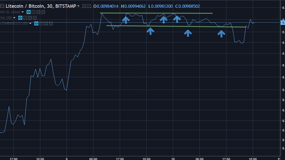
RSI
The
RSI (Relative Strength Index) indicator gives quite good signals at the time
when a given action is in a horizontal trend. RSI simply gives the trader idea
of the speed and change of the price movements.
To
analyze chart using this indicator, it is necessary to determine the overbought
and oversold levels. The overbought level is usually set at 70-80% and the
sell-out level at 20-30%.

Let’s look at the LTCBTC
4hour chart.
The buy signal (B) is
generated with the indicator rising above the sell-out level.
The sales signal (S) is generated
when the indicator drops below the w level.
We can notice that the LTCBTC has formed a
horizontal price action. Based on that scenario, you would build up you
position whenever RSI is below 30 and sell some of your position (eg 25% of all
holdings) every time RSI reaches 70.
Learn how RSI is calculated here
Subscribe to:
Posts
(
Atom
)